Overview
Kaira Engineering is a Milan-based tech company developing advanced software for medical devices. They needed a website that would reflect their precision, credibility, and cutting-edge expertise — without losing warmth or accessibility.
This wasn’t a full rebrand, as Kaira had a strong visual identity created by Davide Fontana (btw check out his illustration work, it’s amazing!), but a web overhaul: new UX, new UI, and a WordPress / Elementor implementation that would make future updates easy for their internal team.
Design approach
The goal was to create a clean, modern platform that could support both product showcases and institutional credibility. It had to appeal to a highly technical audience — but without overwhelming users or feeling cold.
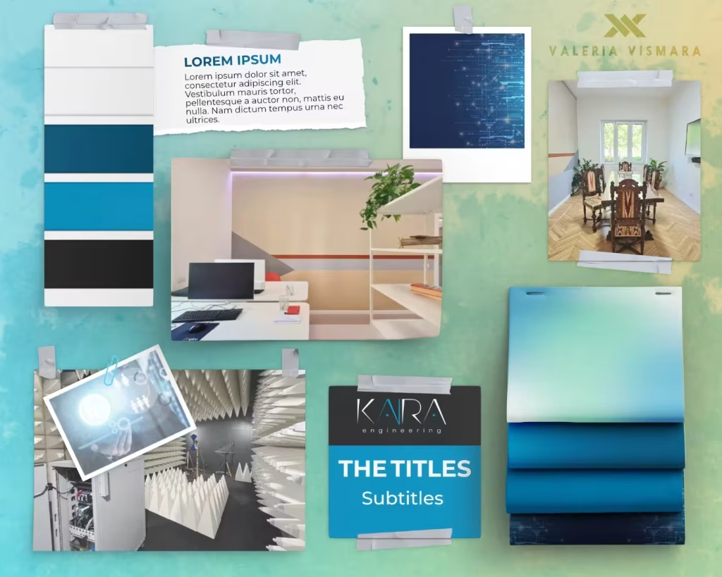
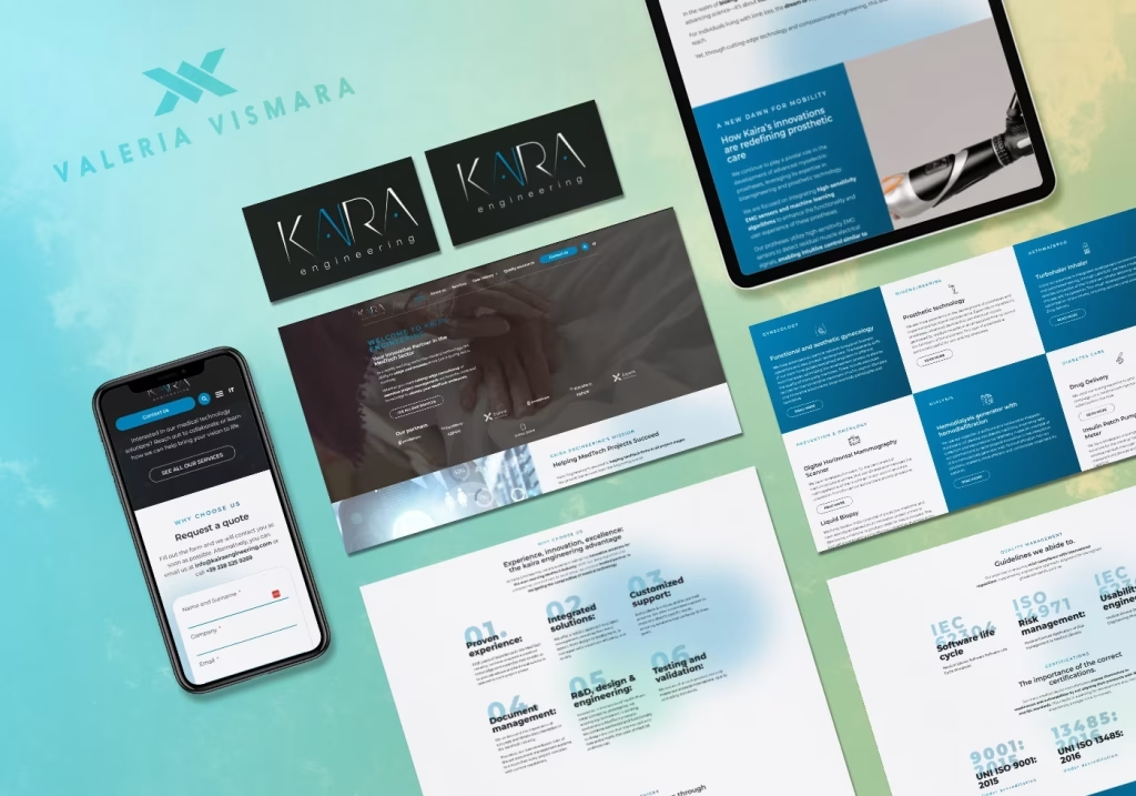
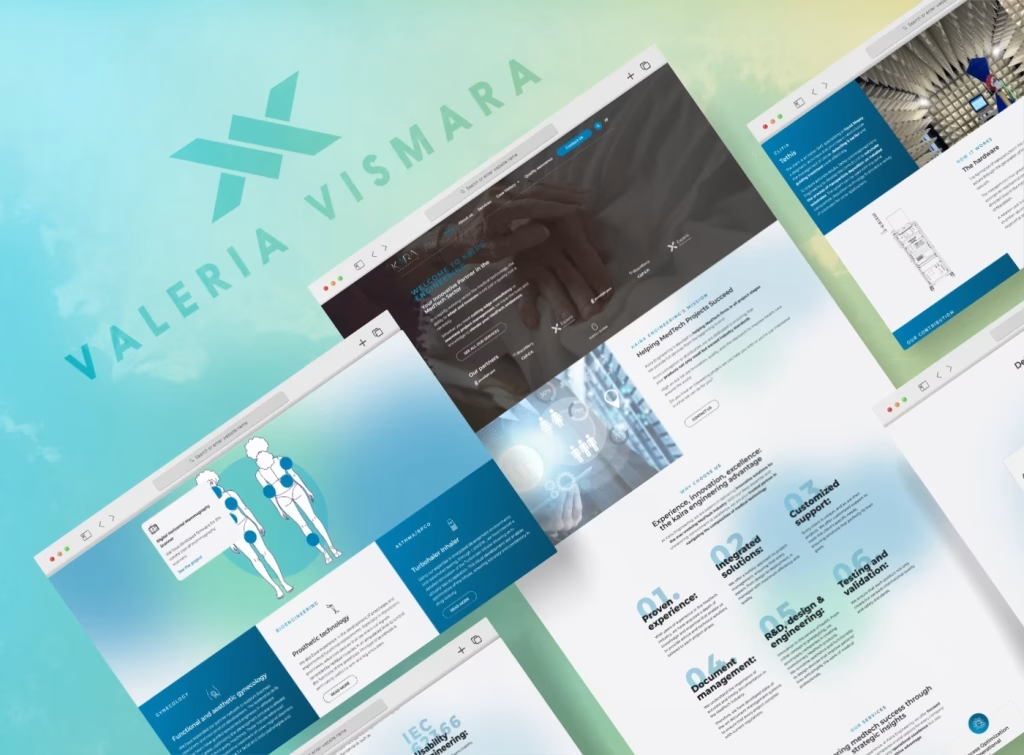
I took inspiration from Kaira’s engineering mindset: precision, reliability, and simplicity. The visual language leans on subtle gradients, sharp typography, and a tech-inspired grid system. Blue and white dominate the palette, keeping everything light and calm, while dark grey accents hint at depth and seriousness.
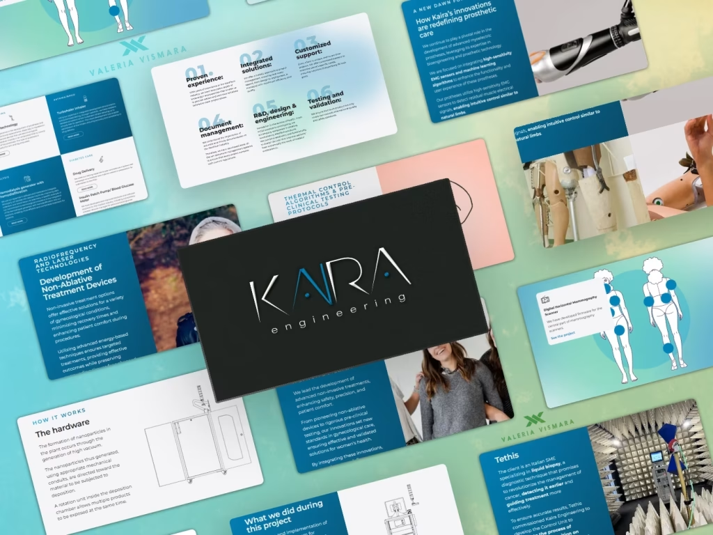
Each product page balances technical detail with visual clarity — perfect for engineers and purchasing departments alike.
Challenges and Highlights
The most demanding aspect was translating highly specialized content into something digestible. Kaira’s team had deep technical knowledge, but no previous structure to organize and present it online.
I helped guide the content writing and architecture process, asking the “dumb questions” to get to the heart of what mattered. This collaboration made the final site not just clean, but understandable.
Another fun twist? The client sent me a batch of wine bottle photos — no names, no descriptions, no labels saying whether it was red, white, or bubbles. Which wouldn’t be a problem… if I drank. But I’m a teetotaler. So naturally, I spent the next few days on a crash course in oenology, zooming in on corks, decoding regional labels, and learning to identify grape varieties like a digital Sherlock Holmes of wine. Not bad for someone who orders sparkling water with dinner.
Highlights and what I am proud of
This project was all about clarity, precision, and tone — just like the work Kaira does. I’m proud of how the design turned out: clean, modern, and confident without ever feeling overdesigned. I helped translate their complex offering into something visually intuitive, especially on the product pages.
One of the key goals was making sure the client could manage the site independently after launch. That’s why I opted for a builder-based solution — not just for flexibility during design, but to ensure they’d be fully autonomous in updating content, adding pages, or making changes down the line.
TL;DR
- Sleek, modern, apple-inspired design of a tech-driven software company website
- WordPress and Elementor, fully custom design
- Multi-language website: English and Italian
- Clean, professional UI with subtle tech inspiration
- Designed for clarity, trust, and ease of navigation
- Built to scale with future products and languages
The Result
The new design reinforces credibility, speaks clearly to engineers and decision-makers, and positions Kaira as a serious player in its field — all with a touch of design and beautifully framed pictures.