This project was a complete redesign of an existing e-commerce site, reimagined with fresh branding and a more intuitive user experience. The goal was to create a Shopify store that is visually appealing, mobile-friendly, and optimized for conversions, making it easier for customers to browse, filter, and select products while giving the client full control over updates.
I handled everything: UX, UI, information architecture, product pages, checkout design, filters, and branding adjustments, essentially rebuilding the site from the ground up.
Design approach
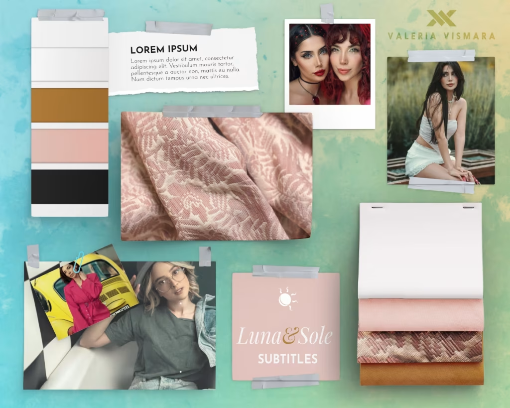
I aimed for a clean, modern look that balances elegance and functionality. The design uses clear navigation, product filters by type and color, and streamlined checkout flows. Every detail was considered to make shopping intuitive and enjoyable, while keeping the brand identity cohesive and vibrant.

Using Shopify allowed me to deliver a fully functional store that the client can manage independently. I structured the backend so updates, product additions, and layout changes can be done without any technical assistance.
Challenges and Highlights
Shopify is great for store management, but its Liquid templating system can be tricky when implementing custom features like advanced filters or product display logic. I had to find creative solutions to maintain flexibility and usability while staying within platform limits and budget.
From the UX perspective, the biggest challenge was reorganizing the product catalog and checkout to improve navigation and make selections clearer. This meant rethinking the homepage, category pages, and filter system to guide users smoothly from discovery to purchase. I also decided to add a size guide to help the customers through their e-shopping journey.
A Personal Side Note
Shopify and Liquid have a way of keeping you humble. I went from thinking “filters are just checkboxes” to realizing they can make or break the whole shopping experience. Between debugging templates and crafting intuitive product flows, I developed a new appreciation for the small details. Let’s just say my brain got a workout, and my caffeine consumption went up proportionally.
Highlights and What I’m Proud Of
The final site is clean, mobile-friendly, and conversion-focused, with a logical structure that makes browsing and filtering effortless. I’m proud of creating a design that feels tailored and professional while keeping the client fully autonomous — from updating products to adjusting layouts or running promotions.
The filters, checkout flow, and product displays are all designed to make decision-making simple for users. At the same time, the new branding and visual identity give the store a fresh, cohesive look that stands out without overcomplicating the interface.
TL;DR
- Complete redesign of an existing e-commerce site with new branding
- Mobile-first and conversion-optimized UX
- Advanced product filtering by type, color, and category
- Streamlined checkout flow
- Shopify setup for full client autonomy
- Cohesive visual identity that balances elegance and functionality
The Result
A polished, functional Shopify store that elevates the shopping experience while giving the client full control. Navigation, filtering, and checkout are intuitive, making it easy for customers to browse and select products. The site balances usability, brand identity, and autonomy, turning a previously frustrating user experience into a smooth, engaging online store.